Blue

Trust, calm, and the many shades of blue.

Meaning of Blue

soothing blue landscape
Picture of blue conveying calm and security taken fromPixabay

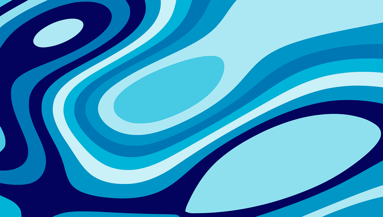
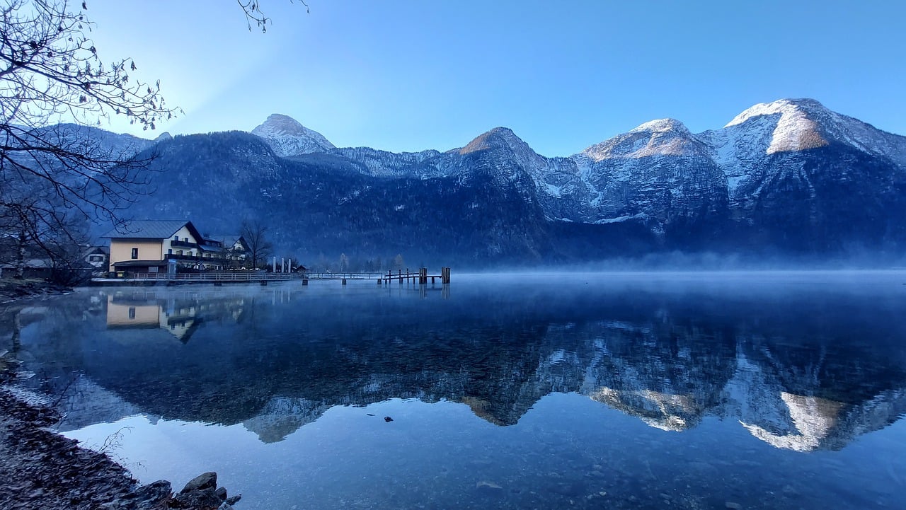
Blue is often associated with calmness, trust, and stability. It gives a sense of reliability and comfort to the viewer.

Brands and designers use blue to create feelings of security, professionalism, and dependability. It's versatile enough to fit many moods depending on the shade.

Shades of Blue

navy, sky blue, teal swatches
Picture of navy, sky blue, and teal with their unique moods taken fromPixabay

Darker blues feel serious and professional, while lighter blues are open and refreshing. Teal or muted blues add a modern, balanced touch to design projects.

Understanding these differences helps designers communicate exactly the emotion they want to evoke with color.

Emotional Effects

Blue naturally relaxes people and builds trust, making it ideal for corporate, healthcare, and educational contexts. It's a color that feels safe and calming.

Depending on context, it can also create a reflective or even a sad mood, so designers must consider the audience carefully.